exit 11 coffee tins
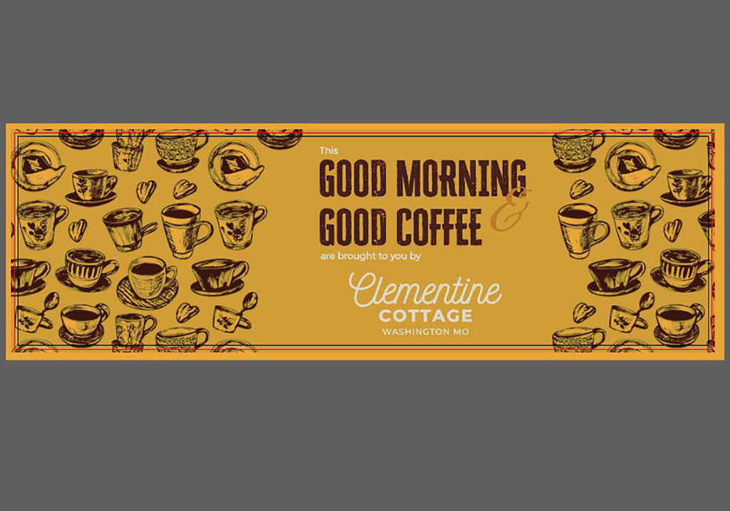
This was a time-sensitive project where I was tasked with presenting the client with a few design options for custom Exit 11 branded coffee tins that would be offered as a complimentary gift at the client’s Airbnb cottage. The goal was to create visually appealing designs that aligned with the aesthetic and branding of both Exit 11 and the Airbnb property.
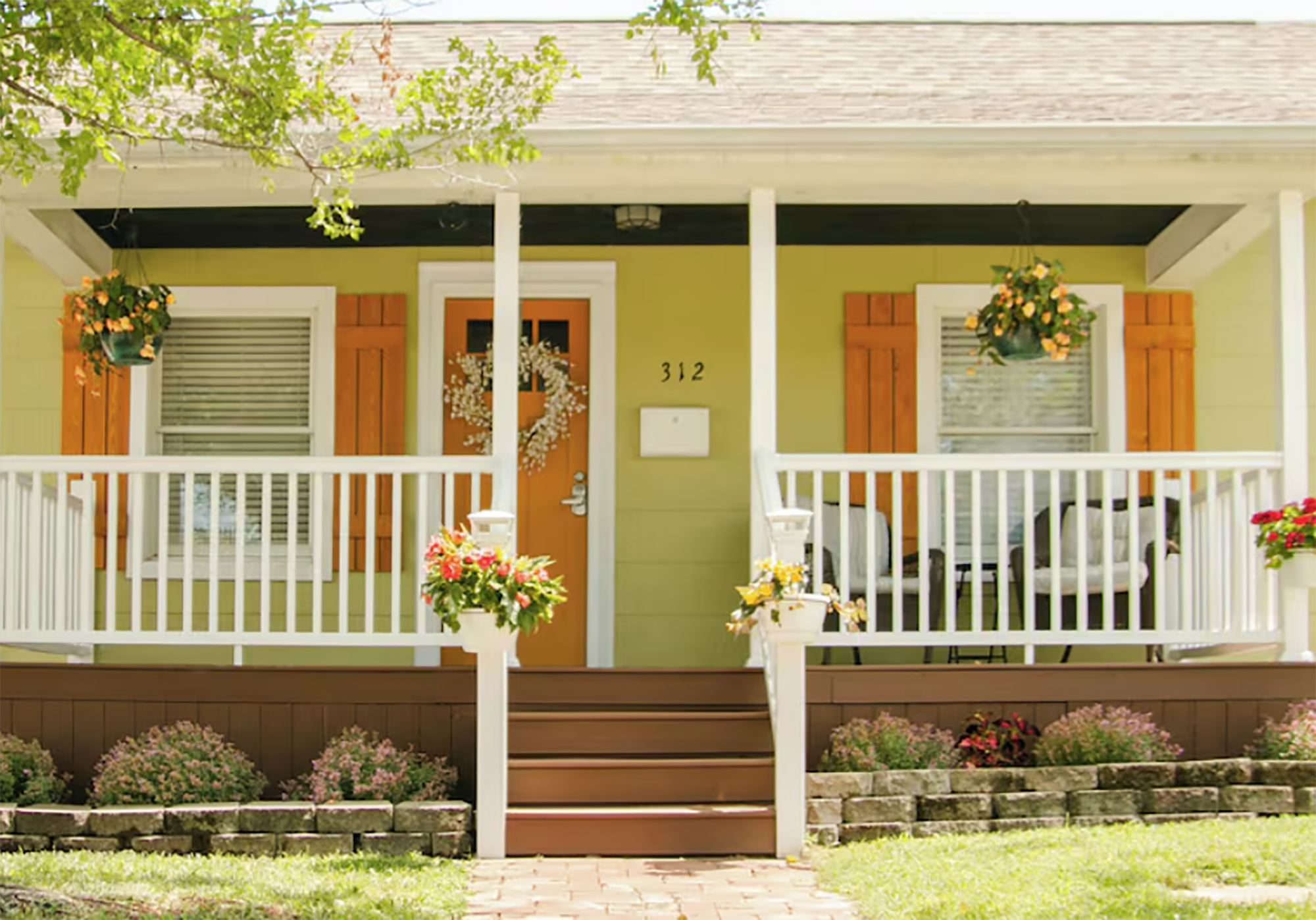
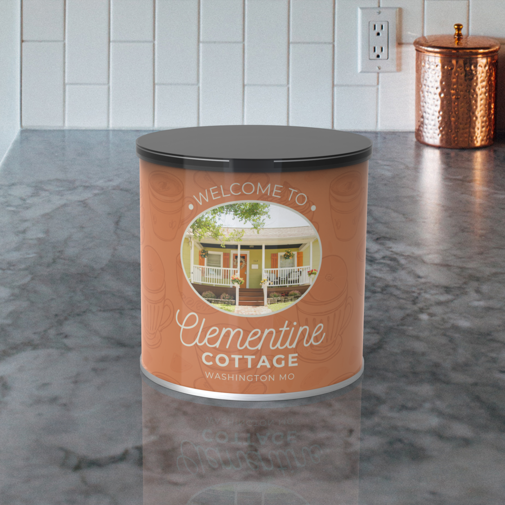
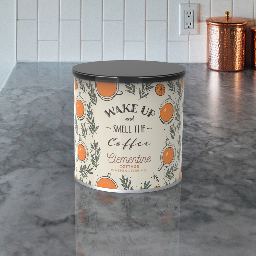
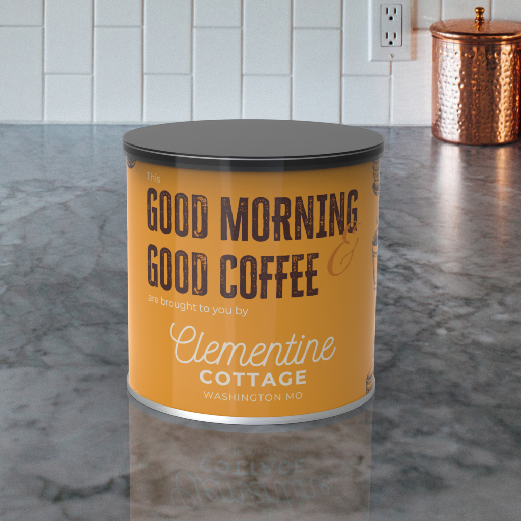
The client specified that they did not want generic coffee beans on the packaging, but wanted to incorporate the orange and green brand colors and gave me the freedom to create some patterns to give a cozy, energized feeling to the tins to simulate the feeling of drinking their coffee. They also had an image of the cottage that was used on their Airbnb site which they wanted to try to incorporate, which I used on one of the tins. They gave me the website we would be purchasing the tins through, which gave me exact die lines and file information.
I proposed four design concepts, each reflecting a unique blend of the property’s interior style and the brand identity of Exit 11. I wanted to achieve a seamless look with the patterns to add to the user experience, but due to the time constraints, the seamless patterning was only featured on a tin that had a bold orange graphic. My final deliverables consisted of four Adobe Illustrator files with options showcasing different color palettes, typography, imagery, and patterns that captured the essence of the coffee brand while seamlessly integrating into the Airbnb’s atmosphere. In addition to the design files, I also had time at the end to make mockups to help the client visualize what the designs would look like printed on the tins.
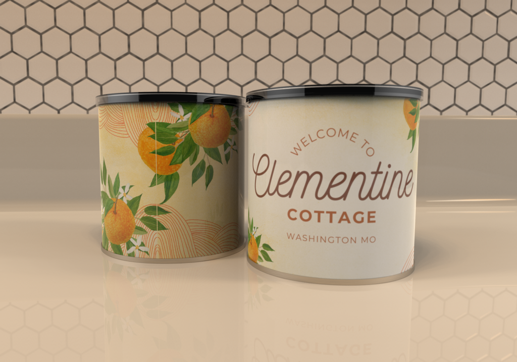
The client was very pleased with the final results and requested that all of the designs be printed and used as various options for the property.