weber holiday packaging
The objective of this class project was to research brand standards of the company of your choosing and curate a unique packaging experience for a special occasion. At the time, I had gotten into smoking meats and wanted to explore a Valentine’s Day-themed pink butcher paper. I chose Weber as my brand due to their strong brand identity and wanted to challenge myself to incorporate their red, black, and white color scheme with some pink.
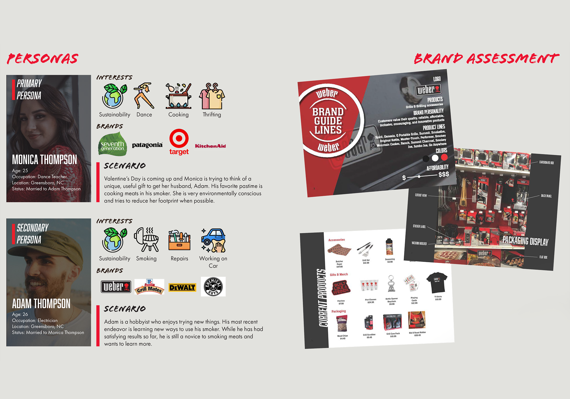
After creating two user personas, I did a Weber brand assessment and became familiar with their products, typography, imagery, and colors.
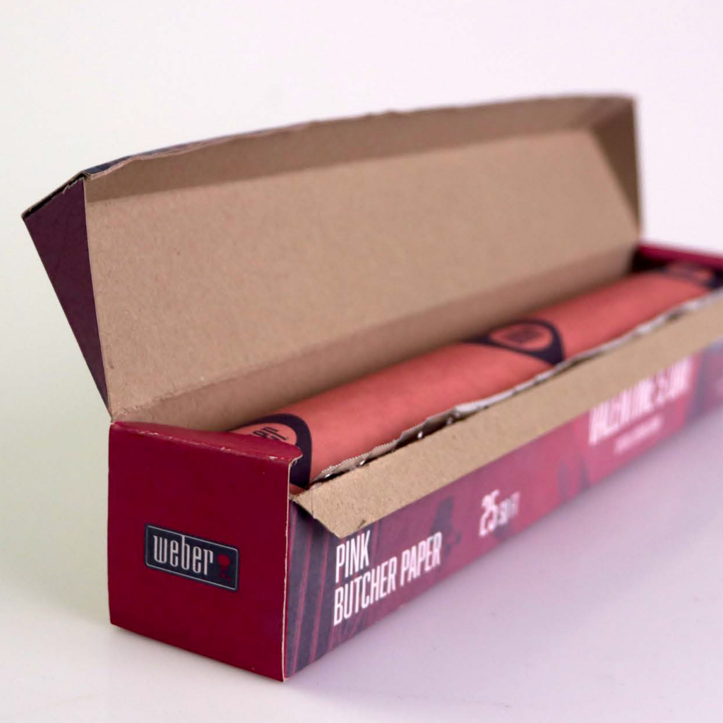
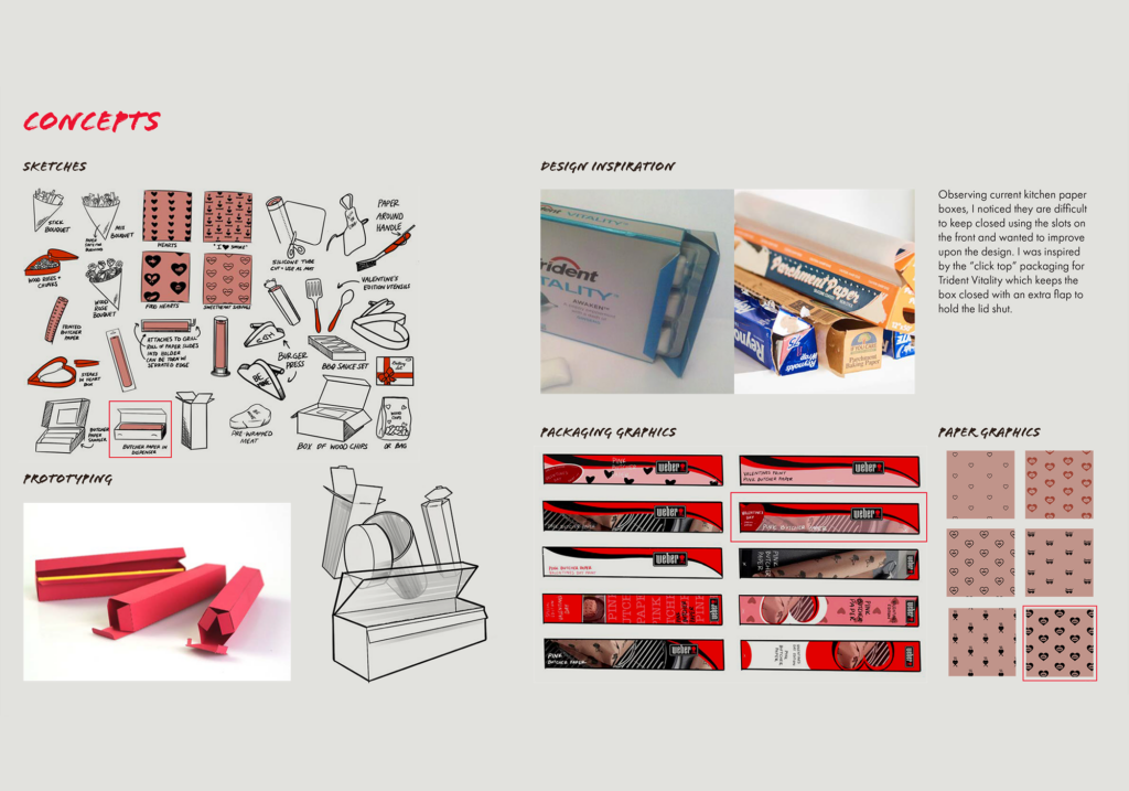
Along with branding, I also created concepts for how the product could be displayed. I decided I wanted to stick with a traditional roll of paper in a box, but improve upon the design by researching packaging techniques to help keep the lid shut without adding too much extra material. I created some prototype mockups to test various box styles and settled on a traditional rectangular chipboard box with an additional flap along the front which provided a satisfying clasp when shut. This design was inspired by the “click top” packaging for Trident Vitality gum.
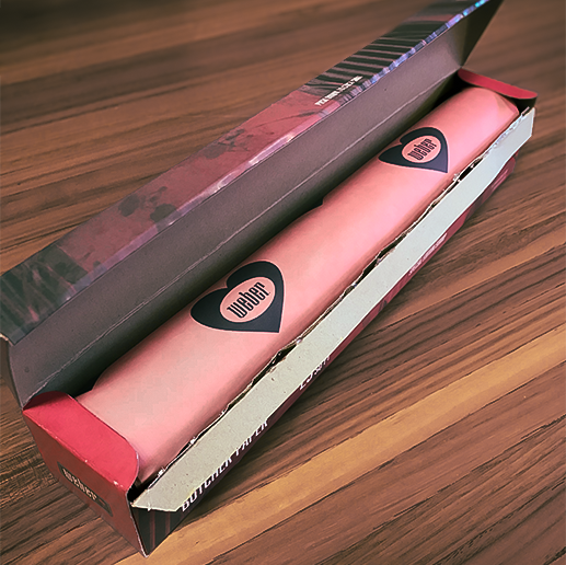
For the paper, I explored various graphics to apply related to Valentine’s Day, ultimately settling on a bold black heart with the Weber logo in the middle.
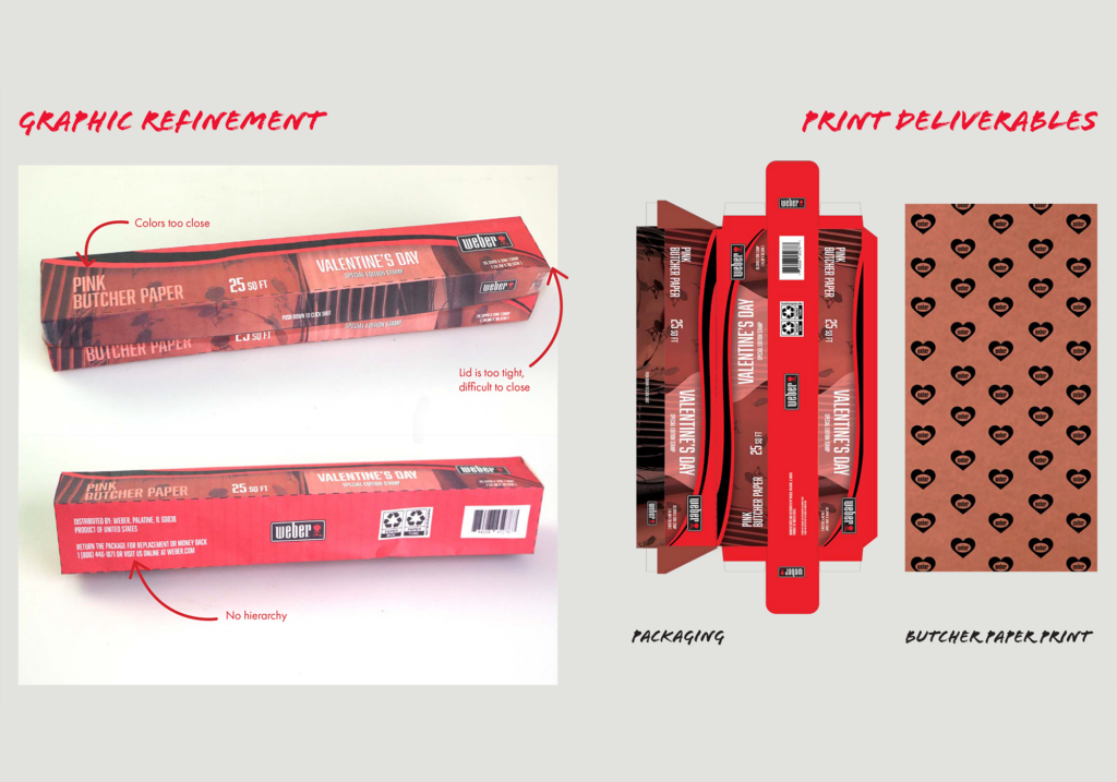
After refining my concepts, I ended up with two print deliverables: one for the box and one for the butcher paper design.